Coming Home.
- Kiri Self
- Feb 10, 2023
- 8 min read
Wow I hadn't realised just how quickly time has passed this term! I've just been so knackered either being at college or sleeping at home that I haven't had any time for anything else.
Anyway, here I am now. I am absolutely loving loving loving doing art. It's totally transformed my life and I am just so happy it's ridiculous. My energy tanked a while ago though so at the beginning of this year I got a motorised scooter thing, and that has helped so much. Have a gander at my superb driving skills - they haven't actually improved at all since this was taken when I first got it - if anything they've got worse as I've got more used to it. The poor lifts at school probably have dent marks from me boinging off the back wall of them as I yet again misjudge the stopping distance of my vehicle. And just the other day I actually mounted the wall in a small room I was trying to reverse out of.
Anyway. Enough of that. ART. What have I been up to?
I've handed in 4 projects so far - two photography, one ceramics, and one colour project. I got merits for ceramics and one photography, and a distinction for my colour project.
The most recently handed in was the second photography one -
Location - A Sense of Place
We had the brief to base 4 shoots (totalling 12 photos as our hand in) over Indoor, Outdoor, Urban and Rural locations. We had to base these on places where we felt a strong connection to and on artist research. Unsurprisingly, when I started my artist research I fell in love with such achievable gems as the following:


And, as I had absolutely no chance of taking any photos that could match these for beauty I decided that I'd do my photoshoots and then in my sketch book hand in not just those photos that I'd taken (that looked nothing like these) but also I'd pair each of them with an artists photo and use photoshop to get something that came out somewhere close to it.
A wonderful wonderful friend called Annie Bungeroth (check out her collection) helped me immensely with the logistics and with artistic advice and help.
Indoors
The first location was indoors so this was easy - Annie came over and got me set up and brought a light with her. I decided that for this location I'd choose items that meant a lot to me - the things that when I unpacked them I felt at home. I've had a lot of moving around over the last few years, and I kind of always feel at home when I have certain things around me. The items I picked were:
2 zebras - I got these as a gift and they always always make me think of my son and me. They are totally irreplaceable to me and I love to look up and see them in my bedroom.
My red lamp - not a sex shop lamp, just a lamp with red and pink dangly bits. It's the thing that I know I'm home when I get this out. It has featured in a fair number of Facebook posts and I got it when I first moved out on my own ten years ago.
My glass mirrored jewellery box - I love this this so much and it is so sparkly!!!! Truly a wondrous thing to behold.
A purple glass bottle - this was on my mum's dressing table when we were young. I remember there being a lot of ornaments that we had to dust, and we had to be really careful not to break things. This seemed really mysterious and glamorous for some reason to me, and I don't know when I acquired it, but it's really pretty.
My rainbow blanket - that I'm in the middle of crocheting I dyed the yarn for it and I love how soft and bright it is.
A blanket that Maggie crocheted for me. I ended up using this for the backdrop as it made such a pretty light.
So - first up, my inspiration was a photo by a genius artist called Gina Soden. I absolutely love her photography and how she makes the ordinary extraordinary.
I took this photo:

And Gina's 'Peacock Castle on a Mirror", and created this pairing:


Next up - a picture of a table that my Grandfather made for me, reflected in my mirrored jewellery box. Annie loves to find reflections of people all around her in her work, and helped me to see the beauty of looking at something from a different angle.

For this one I looked to inspiration from Anselm Kiefer and a series of paintings that he produced called 'Parsifal':
"The Parsifal cycle comprises four large paintings, of which three are owned by Tate. The titles refer to Richard Wagner’s last opera Parsifal and its source in a 13th century romance by Wolfram von Eschenbach, which was based on the legend of the Holy Grail. The setting for this painting is Kiefer’s attic studio. The presence of a baby’s cot points to the birth and early life of the hero Parsifal. It also suggests that the artist’s studio is a place of genesis."
They really reminded me of my Grandfather reading 'The Little House in the Big Woods' to me as a small child, and how I imagined the little house looked in those big woods of Wisconsin.
So, from that:


came this:

For the final pairing of the indoor location I wanted to showcase my rainbow blanket but somehow bring everything else in too. And for this one I travelled to China to an amazing photographer called Fan Ho and photos that he took of Hong Kong:
"Dubbed the “Cartier-Bresson of the East”, Fan Ho patiently waited for ‘the decisive moment’; very often a collision of the unexpected, framed against a very clever composed background of geometrical construction, patterns and texture. He often created drama and atmosphere with backlit effects or through the combination of smoke and light. His favorite locations were the streets, alleys and markets around dusk or life on the sea."
And from this:

I saw this:


And that completed my Indoor location, and I was really happy and actually enjoyed it way more than I thought I would.
For the three outdoor locations (Urban, Rural, and Outdoor) I decided to do it all as one shoot, and take them on the Marazion beach overlooking St Michaels Mount. The mount has always been special for me and my son - when we came down every holiday to spend time with Granny we loved seeing the mount come into view and we knew we had arrived at the end of our long journey.
Outdoors
My Outdoor photos mirrored the Indoor in that they were views of one main subject taken from a different view than normal.
First up -

paired with a photo from a beautiful photographer called Patricia Davidson. This photo is called 'Vintage Bicycle'


I loved the bright colours of the bicycle and the lavender, and the way that the two slightly derelict means of transportation still found use or beauty even at the end of their journeys.
The next photo was a real struggle for me. I didn't like the bright green of the leaves, but I loved their shape, and I really loved seeing the reflection of the mount in the window. But how to make it work?

And then I remembered a photo I'd seen in my research - and it all just fell into place. I didn't go the exact same salmon pink as for me, that was just a bit too...salmony. I like my pink better.


And the final photo in this shoot was a beautiful view of the mount from the dolphin garden next to the Godolphin Hotel. I'd never seen it from exactly this view before and I have included it as the only one to not have a corresponding artists image. All I did in photoshop was crop and straighten, and I possibly tweaked the lighting/colours ever so slightly.

Urban
For this shoot I decided to focus on photos by Gina Soden - she used photoshop to bring quirk and fantasy to her work.
"Soden’s approach is lyrical and directs the viewer to explore the concepts of time and memory. The compositions feature derelict asylums, long since closed schools, ex-military compounds and famous city power stations in various stages of decay. The results are striking and poignant, at once both edgy in their contemporary aesthetic and nostalgic in their ruinous beauty."
For my first in this series, I took this:

and inspired by the absolutely stunning 'Blue Orphanage' came this:


When printed the similarity of the colours was really striking, and the colours of the ceiling towards the back of Gina's photo really brought out the turquoise of the sky in my image, whilst the Marazion sign reflected the foreground of hers.
I really liked this photo - we were just going past from the beach on our way to the Dolphin Garden, and I noticed how all the greens in the trees and foliage and the green of the car just kind of stood out to me.

and when I came to look through my Gina photos, this pairing just made total sense. In hers the green of nature overtakes the decay of the manmade - in mine it unfortunately reflects the reality of the world we live in and the manmade drowning and destroying nature wherever we go. Possibly a more depressing view of things...


And the last was one of the most difficult of all my photos to get just right but I was really pleased with it at the end. As with all of the photos in the 'Urban' series, this really did look better as the printed versions.


Rural
This was a simple series to photograph - a focus on one main subject for each photo - but a tricky one to manipulate in the way that I wanted them to be.
In my last photography set of research I'd come across the work of Rachael Talibart - I just don't even know how she creates such awe inspiring work as she does. It's insane. I took one of her Sea Change images, from her series inspired by Ariel's song from The Tempest:
" Full fathom five thy father lies;
Of his bones are coral made;
Those are pearls that were his eyes:
Nothing of him that doth fade,
But doth suffer a sea-change
Into something rich and strange. "
and this:

and after a loooong time and a lot of failed attempts, I got to this:


I had to keep reprinting this one as I couldn't get the background colour right. I like this because in my photo you have the seaweed and then you also have the tiny paw prints from Peach.
I really loved taking this next photo, because my dog was just so happy that day, bouncing around on the beach. She has changed so so much since I got her, and all for the better! She's almost a healthy weight and being the lovely needy dog that she is she loves all the one on one love and attention she gets.
But going from this:

via this beauty from Patricia Davidson again:

to this, was no mean feat:

When printed I was ever so pleased with it. We will never get the crazy kind of sunsets that she gets from the Oregon Coast, but that's why they invented photoshop! (And anyway I bet all the photos that I love for their colour and brightness must be manipulated in some way or another.)
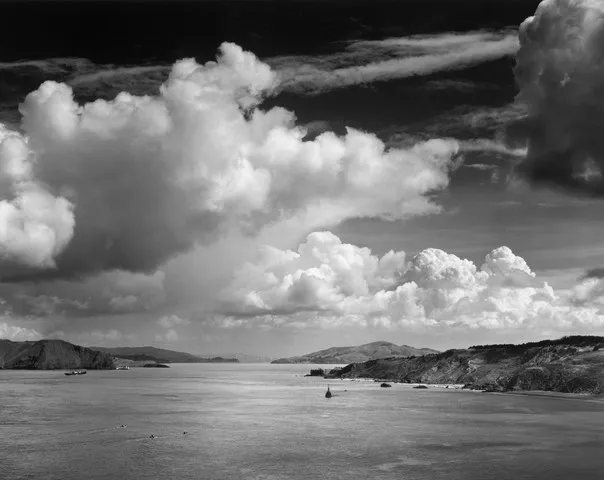
And that brings us to the final image - and for this one, I looked to one of the most well known photographers ever (not that I'd heard of him before I started actually appreciating art, rather than being slightly bored by it) - Ansel Adams. He took some really beautiful pictures around the Golden Gate (even before the Bridge) and the Yosemite Park. So I took a vibrant green weed growing out of a wall:

and one of the most iconic of his photos - Half Dome, Merced River:

and created this:

And that was it. My mammoth journey to find a home, and where I belong, and I think I've found it.


Comentários